
"Being the client and the designer often makes the decision process the most difficult as you over think everything... for so.sauna though it was gut instinct that lead me to the brand identity and personality. I wanted a logo that was memorable, friendly and warm. Sitting alongside a broader brand personality that was fun and positive.
Melanie Sramek-Bennett | so.sauna
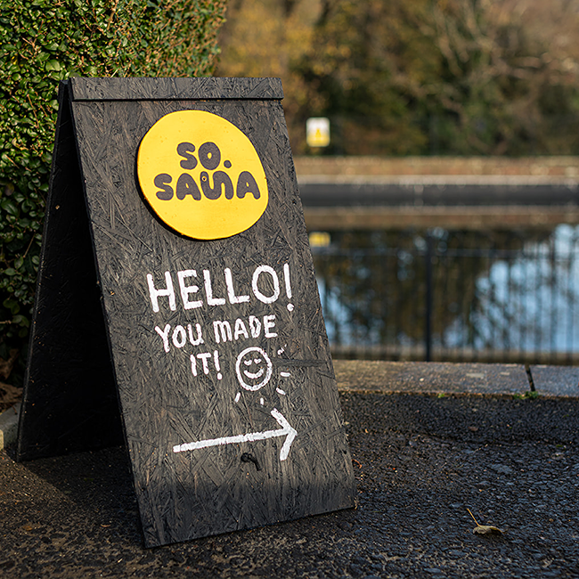
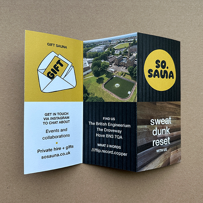
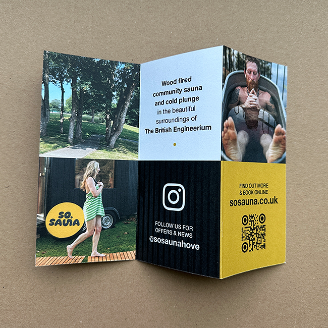
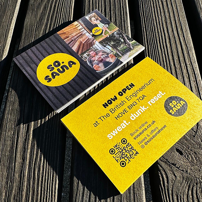
so.sauna is a community horsebox sauna in The Secret Garden at Hangleton Manor, a gorgeous green space surrounded by history. Open to all, offering heat and cold plunge in beautiful surroundings. This small independent business hopes to become a familiar part of local community life, encouraging users to socialise, sweat, dunk and reset.
The new pub with benefits?

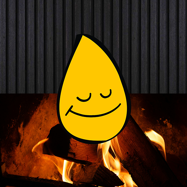
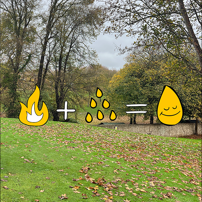
My starting point was the intention to create a warm, friendly logo that would be memorable and would reflect the feeling you get after a sauna session, I call it the marshmallow feeling; Warm, fuzzy and relaxed.
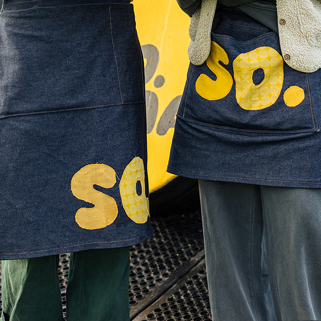
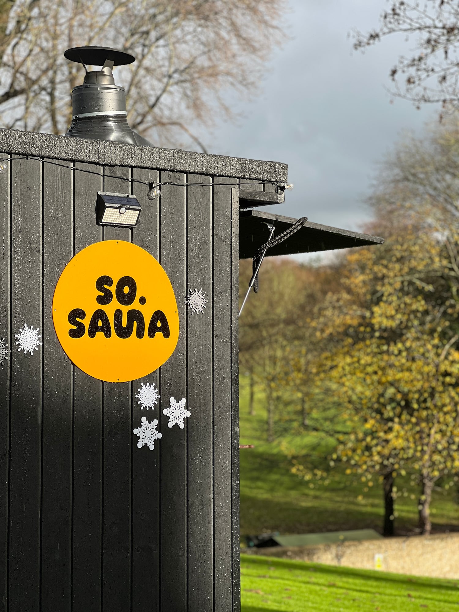
A rounded font with a connected icon within the word echos the process of sauna, hunkering down inside then dunking into the cold plunge. A bright warm yellow was an obvious choice against the black traditional cladding.
The brand personality evolved as black became our base colour with yellow accents. Simple line illustrations add personality and a welcoming feel to the website, socials and flyers.
Find our more at sosauna.co.uk
Got a project? Let's chat.
07740 305 734 or melanie@aspaceforsomething.com